PATIENT MEDICATION FOLLOW-UP
Closing the Loop Between Human Care and Automation
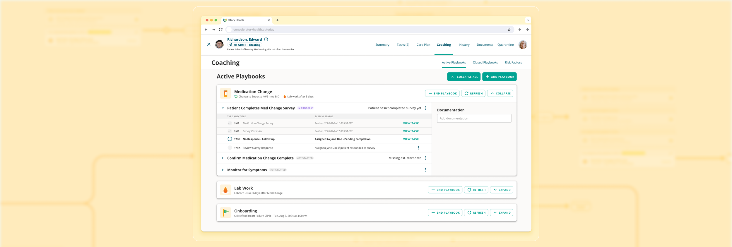
When patients left appointments, clinicians had no way to know if medication changes were understood or followed. I designed a mobile survey and workflow that turned patient confirmations into structured signals. These structured responses enabled Story Health to automate follow-ups and escalate to a coach when patients signaled confusion.
Role
Lead Designer
Contributions
UX Strategy, UI Design, Interaction Design, Prototyping, UX Research
Company
Story Health
Year
2024
SOLUTION
Helping Patients Stay on Track
Clear Instructions at a Glance
Patients saw a simple summary of medication changes written in plain language.
Structured Confirmations
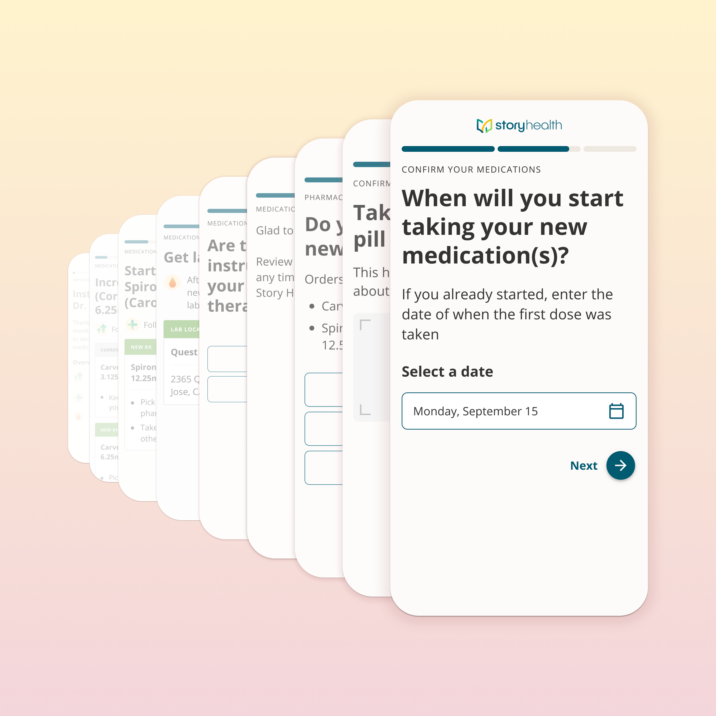
The survey captured whether patients understood changes, stared their new meds, or needed help.
Automated Follow-ups
Patient responses triggered the right next step, such as an automated check-in or coach outreach.
Smart Follow-ups
Once patients entered a start date for their new medications, Story Health automatically scheduled check-ins and symptom surveys. Coaches could then focus on higher-touch support instead of chasing down confirmations.
ITERATING TOWARDS SIMPLICITY
Confusing Instructions Derailed Patients From the Start
Even though we tested the instructions survey design with participants from a similar demographic, it wasn’t until real patients used them that we realized the language wasn’t working.
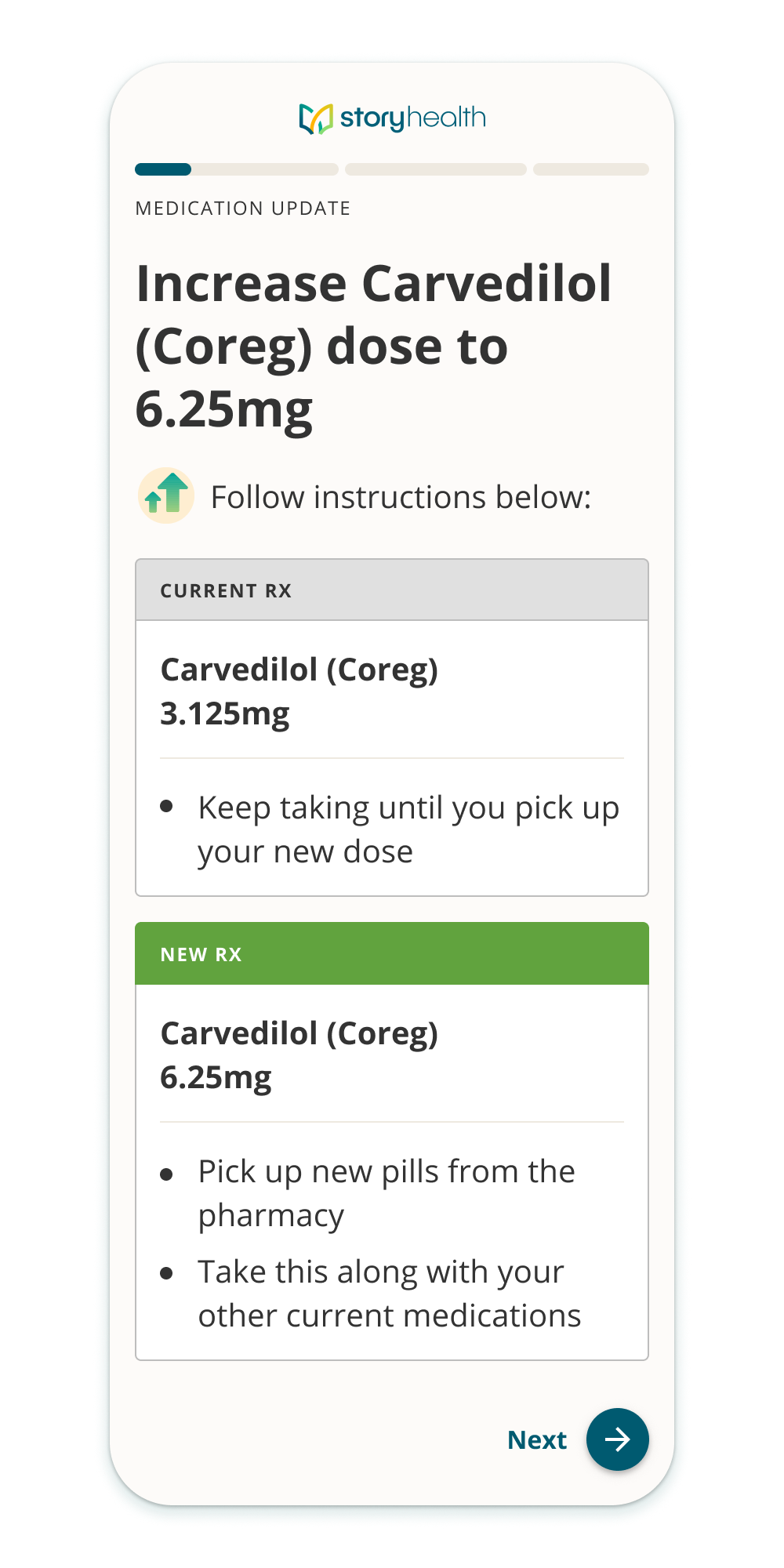
BEFORE
Patients were told to “increase” the a drug they were currently taking. Instructions for the current dose and new dose were displayed in separate cards, which was too complex.
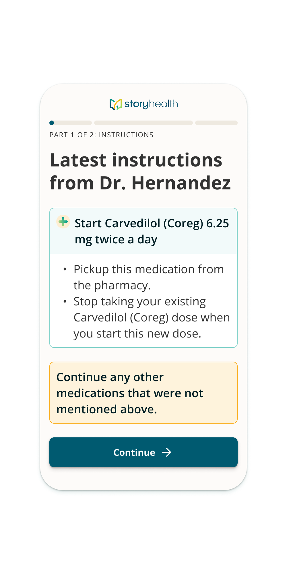
AFTER
Instead of “increase”, patients are instructed to “start” a larger dose. Additional instructions related to that drug are all grouped together in one card to visually simplify the information.
REDUCING DROP-OFF
Getting to What Matters Most
We learned that patients were dropping off before reaching the most important step: confirming when they started their new medication.
BEFORE
Each medication change had its own instructions screen, which made the beginning of the survey lengthy. Patients often abandoned the survey before ever entering a date.
Average of 6-8 screens until the user got to input a date.
AFTER
Through testing, we simplified the flow. We stacked instructions up front into the first screen, reducing screens and guiding patients quickly to a date input that drives follow-up automation.
Only 3 Screens before getting to input a date
IMPACT AND RESULTS
27%
Increase in completed surveys
44%
Reduction in time for patient to complete care plan
60%
Reduction in hospitalizations
Want to know more?
Fill out this form to get in touch.
View Other Projects


