DESIGN SYSTEM FOR A DIABETES APP
Designing a Flexible, Accessible Design System for Older Adults.
Onduo’s app was a patchwork of inconsistent components, slowing the time it took to build new features and confusing users. As a collaborator on the design system, I helped audit components, define principles, and create flexible, accessible patterns, so the team could move faster while keeping the product clear and consistent for older users.
Role
Visual Designer
Contributions
Visual Design, Iconography, Component Creation, Design Documentation, Prototyping
Scope
Design Systems, Mobile Design
Company
Verily Life Sciences
Year
2019 – 2020
THE CHALLENGE
Inconsistencies Slowing Teams Down.
Before the design system, Onduo’s app was entirely hardcoded. Each new feature required rebuilding components from scratch, which led to inconsistent visuals across colors, buttons, cards, and illustrations.
For designers, these inconsistencies caused slower design and prototyping workflows.
For an app supporting older adults with diabetes, these inconsistencies risked adding unnecessary confusion to an already sensitive health journey.
Audit of all the screens in the app to see the inconsistencies
MY ROLE
Collaborating With the Verily Rapid Design Team
My contributions as a visual designer on the team:
Audited existing components
Helped define principles for consistency
Explored flexible patterns and components
Checked accessibility with a focus on older users
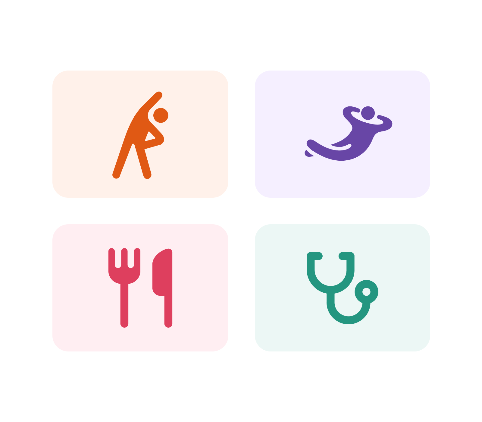
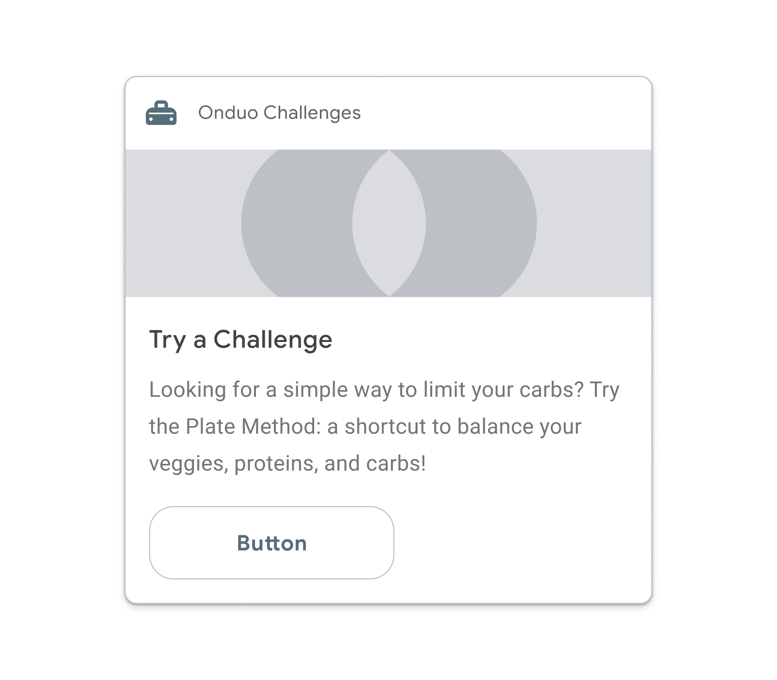
Component Explorations
FOCUS ON THE USER
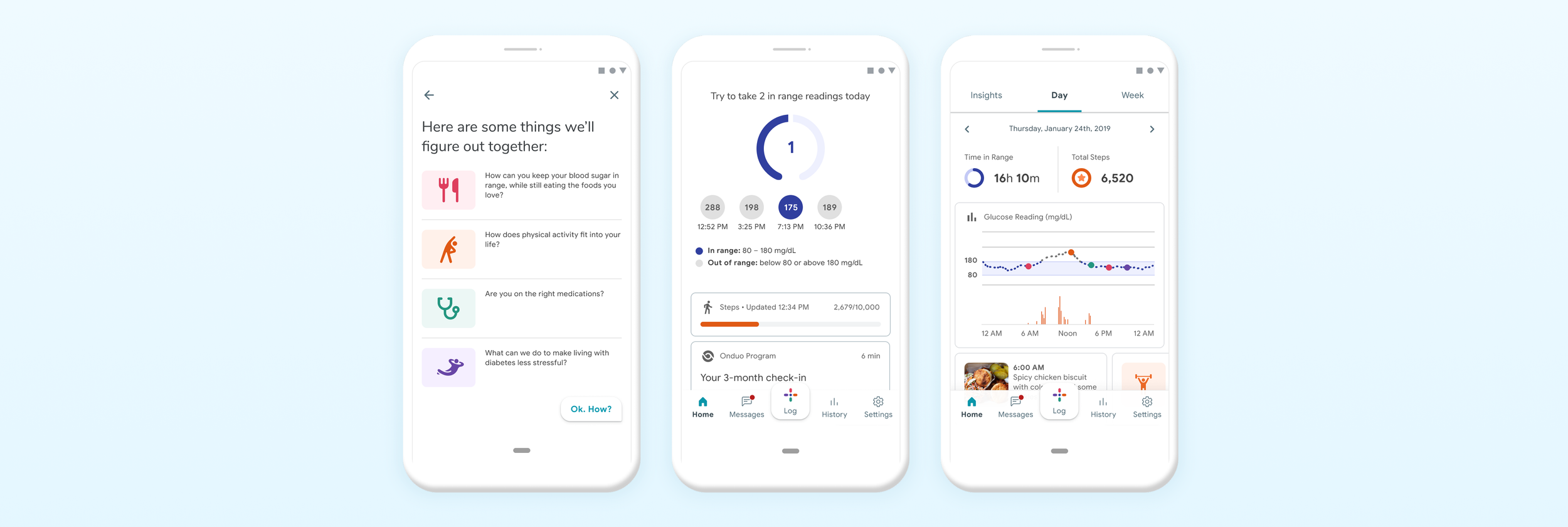
Designing For Older Adults
We started with Material Design as a base and shaped it with our own design principles: friendliness, approachability, and confidence. These principles made the product felt trustworthy, accessible, and credible.
High contrast colors and clear illustrations
Extra rounded corners to create a friendlier look
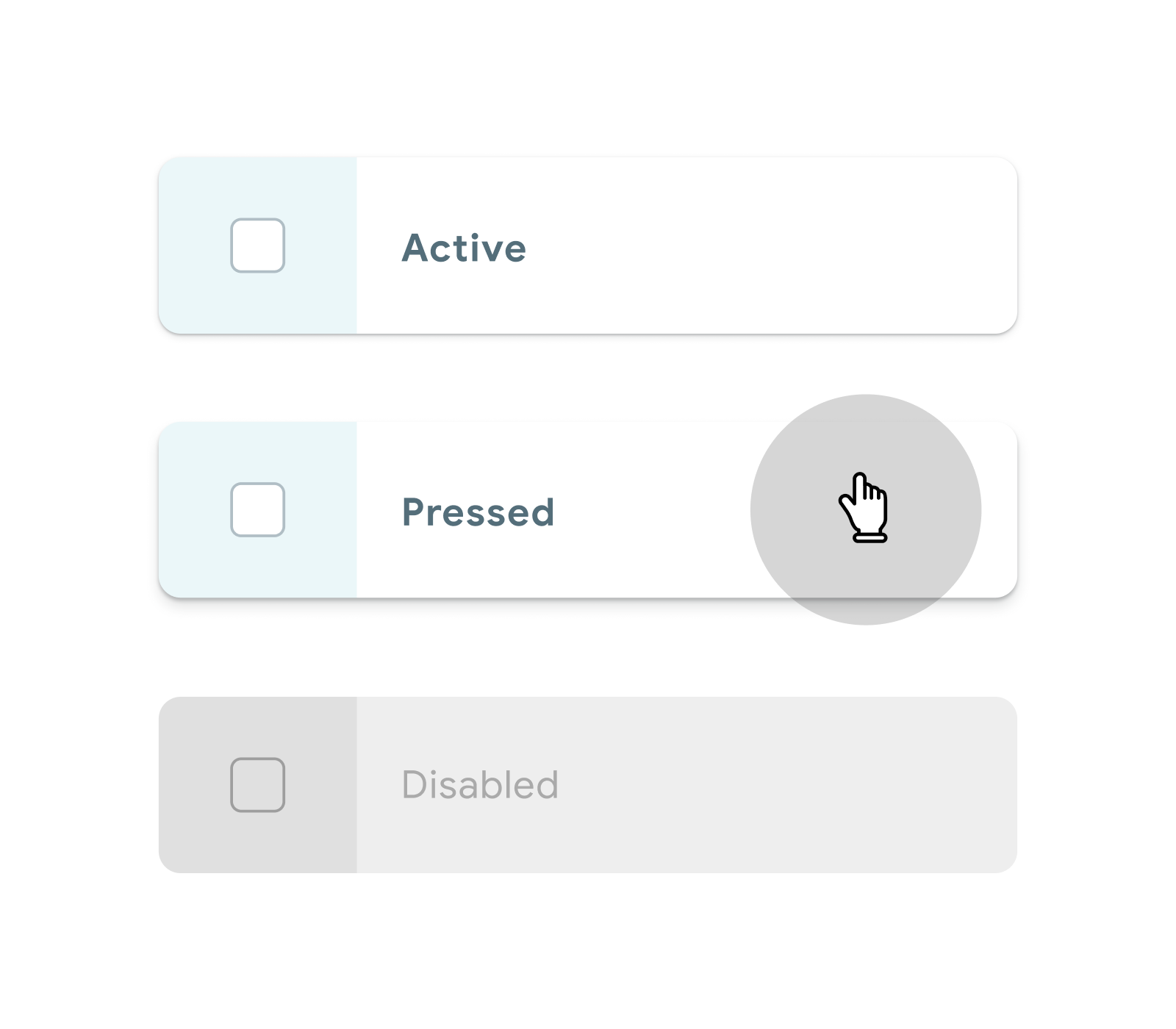
Larger padding and touch targets to reduce errors
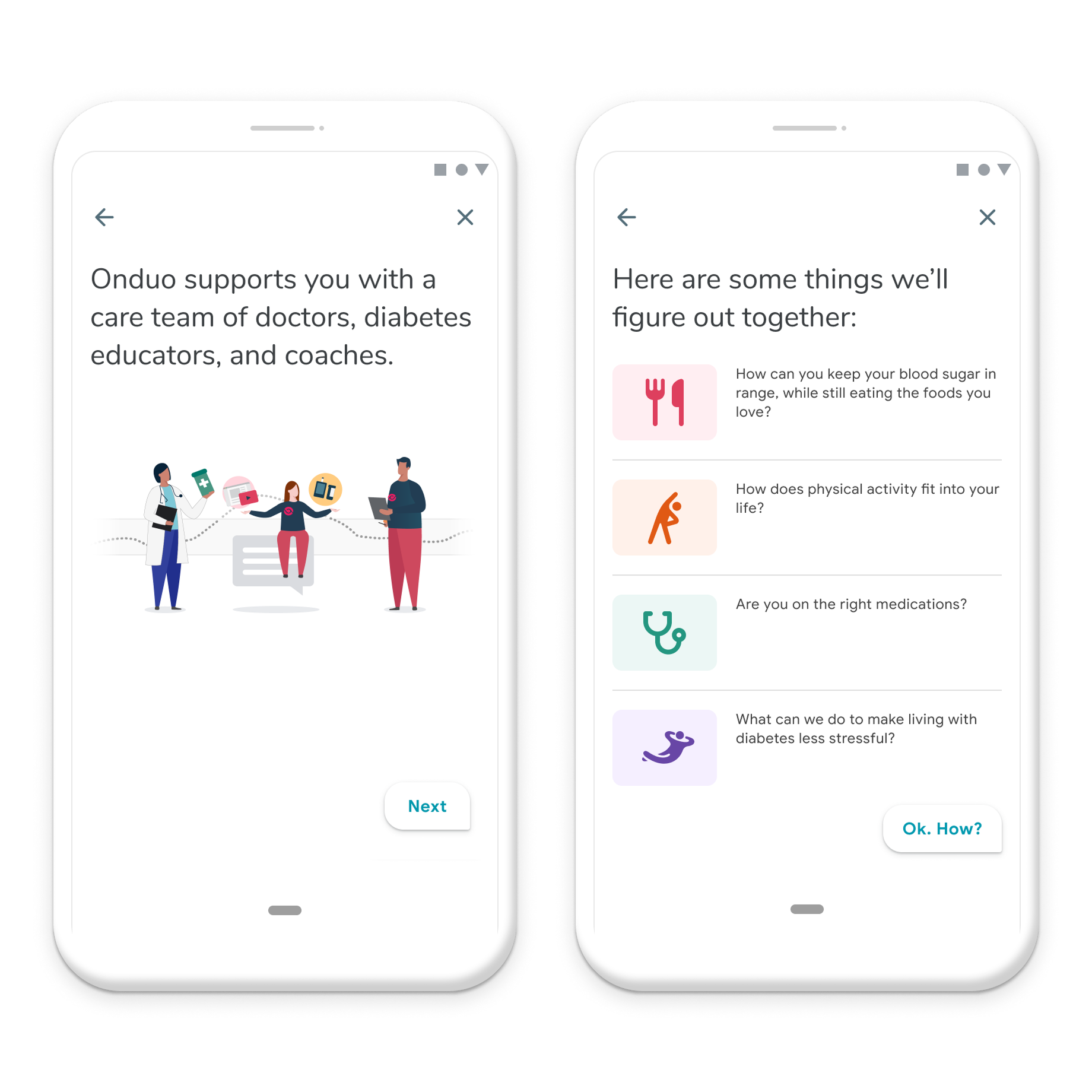
User Onboarding Screens
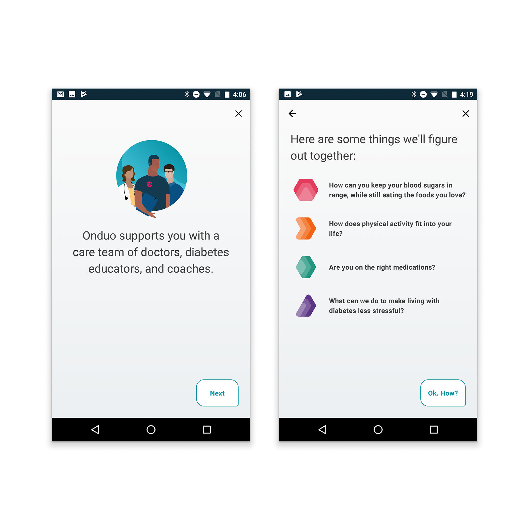
BEFORE
Rigid, abstract imagery lacked warmth and felt clinical.
AFTER
Clear, figurative illustrations make the content feel more approachable.
Home Dashboard and History

BEFORE
Dark, dense layout with limited hierarchy made it harder to spot progress and trends.

AFTER
Light, structured design with clearer hierarchy made data and insights easier to understand.
IMPACT AND RESULTS
The final output included:
Documentation of component specs and implementation status
Component and icon library in Sketch
Stickersheet file shared across teams
These resources became a single source of truth that sped up prototyping, ensured consistency, and made collaboration between designers, writers, and developers much smoother.
Want to know more?
Fill out this form to get in touch.
View Other Projects
-
![Screenshot of a healthcare coaching software dashboard showing active workbooks and tasks related to medication change, lab work, and onboarding, with options to end playbooks, refresh, expand, and collapse.]()
Playbooks: Visibility into Automated Flows for Greater Trust and Control
-
![Person viewing medication instructions on their phone]()
Medication Follow-up: Closing the Loop Between Human Care and Automation
-
![Interior of Udacity office reception with a wooden wall, digital logo sign, a white desk with an iMac computer, and a blue and white poster that says "Students First".]()
Udacity Office Mural
-
![Five bottles of Teranga fruit juice with different flavors and colors.]()
Teranga Brand Itentity