TERANGA BRAND IDENTITY
Rooted in Culture and Grown with Purpose
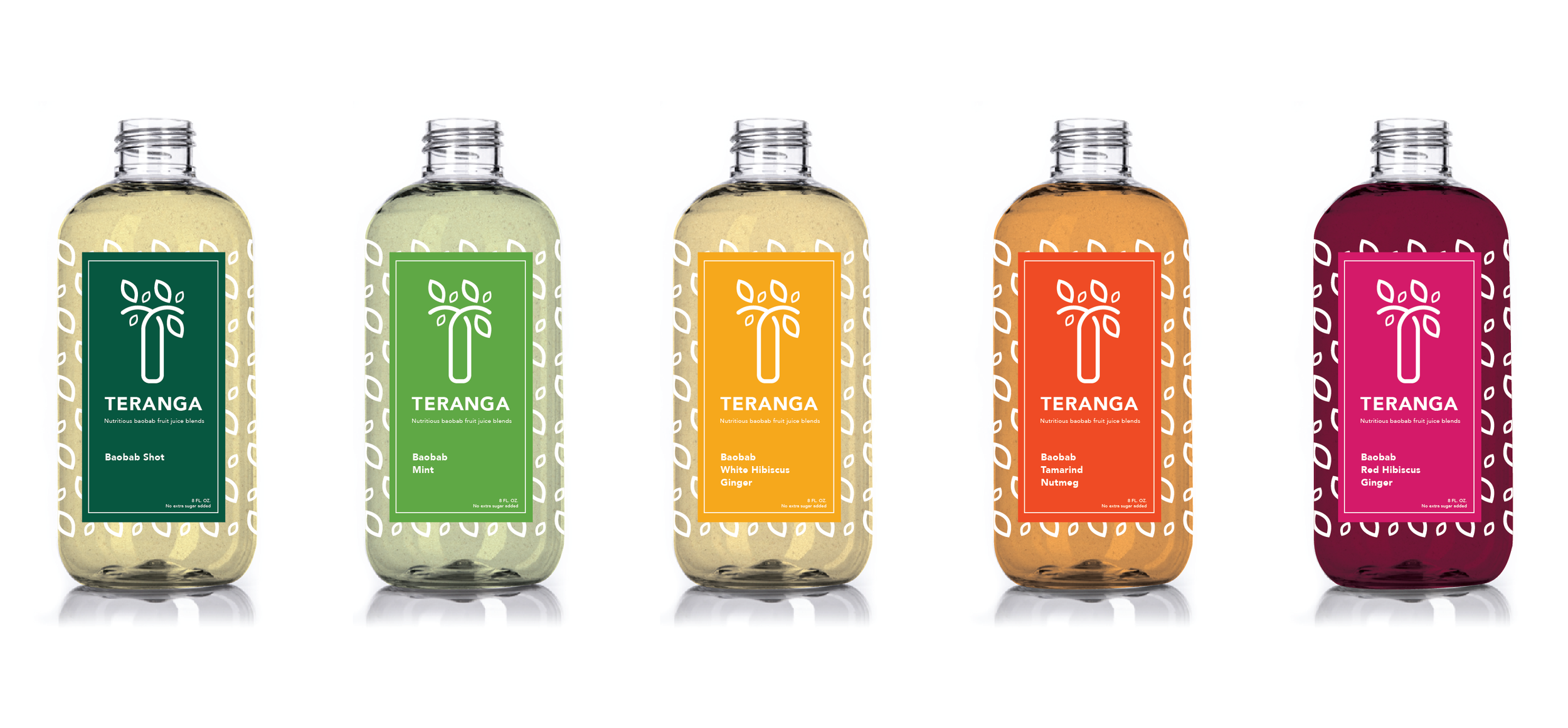
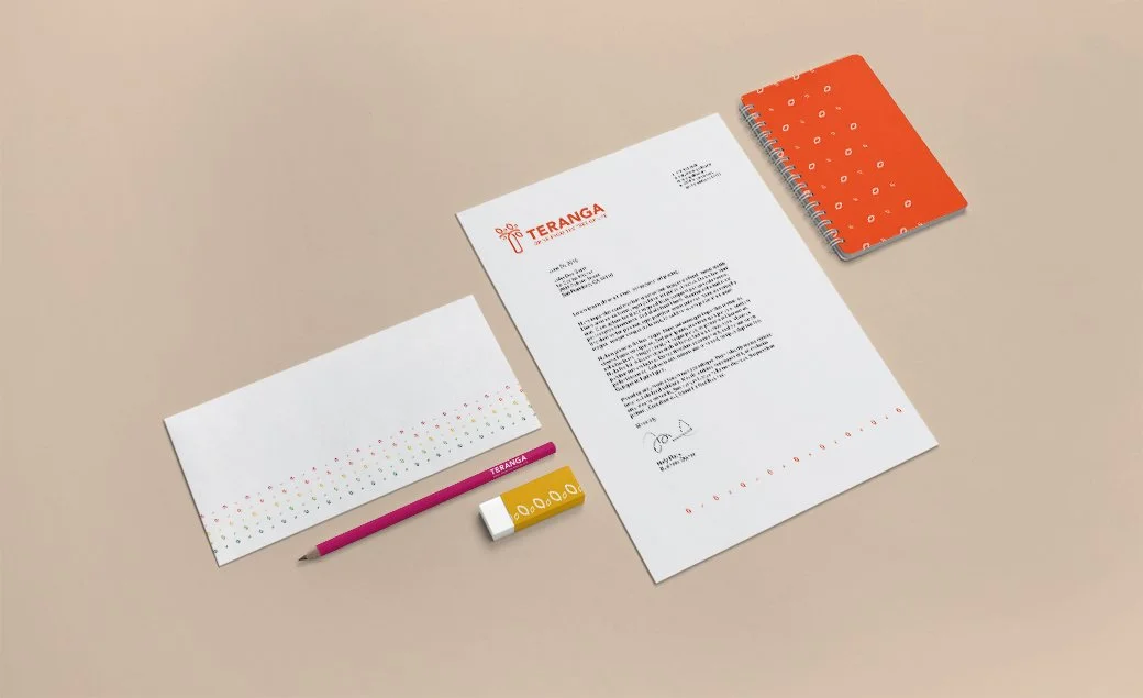
Teranga is a women-owned juice brand inspired by the Senegalese value of hospitality and the baobab tree, known as the “tree of life.” I designed the logo through a local incubator program supporting women-led small businesses. At the time, Teranga focused on launching its line of baobab-based juices, with plans to expand into food and community-serving initiatives.
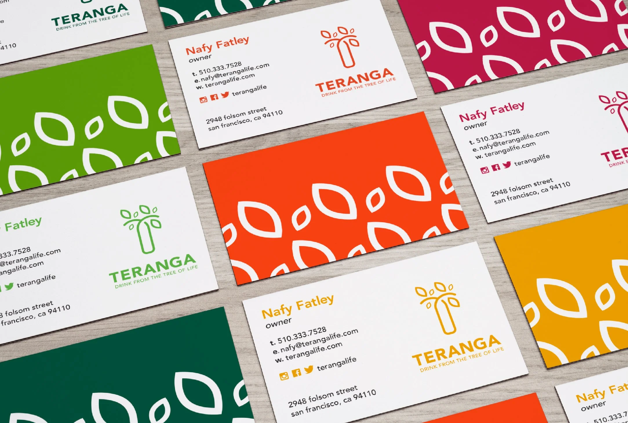
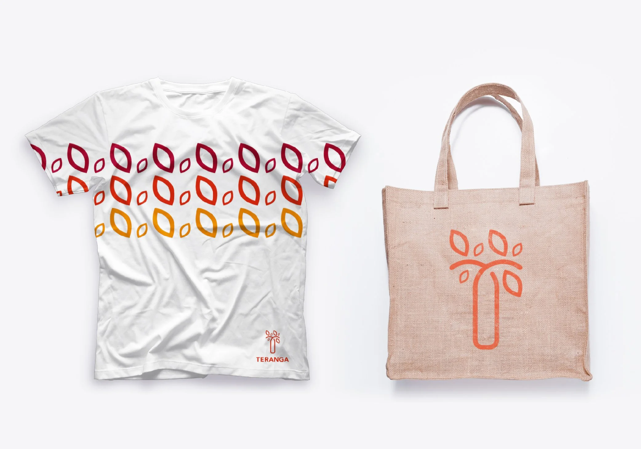
I explored ways to incorporate the baobab tree’s symbolic shape and meaning into a simplified, versatile mark. Bright orange was used to convey vitality, warmth, and shelf appeal. The final logo balances organic forms with clean, modern lines to represent natural ingredients and a welcoming spirit.
Role
Brand Designer
Scope
Brand Identity Design
Client
Teranga
Year
2015
Want to know more?
Fill out this form to get in touch.
View Other Projects

